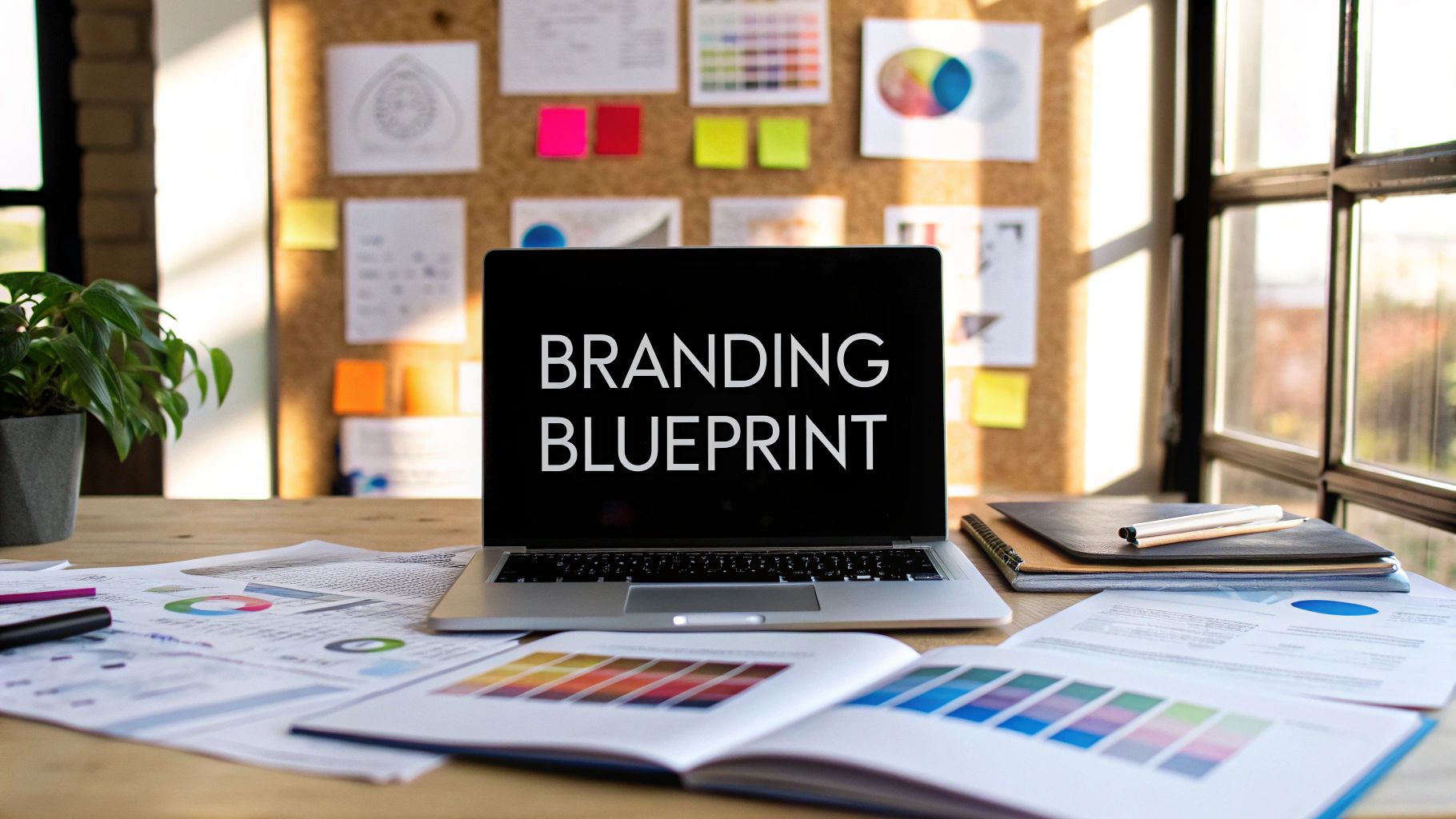
How to Create Branding Guidelines: A Quick, Practical Guide
Discover how to create branding guidelines your team will actually follow with practical steps and templates.
Think of your branding guidelines as the rulebook for your brand's personality. It's where you capture everything that makes your brand unique—its mission, its voice, its look—and put it all down on paper. This isn't just about rules; it's about making sure every single thing you put out there, from a logo on a hat to a social media post, feels like it came from the same place.
This consistency is what builds trust and makes people remember you. It’s the first real step toward managing your brand instead of just letting it happen.
Why Strong Branding Guidelines Are Your Secret Weapon

Let's be real for a minute. The term "branding guidelines" can sound a bit dry, like some corporate binder destined to collect dust on a shelf. But in practice, it’s the most powerful tool you have for making sure your brand shows up the same way, every time, no matter where people see it.
Without this guide, your marketing can start to feel scattered. One piece of content looks and sounds one way, the next feels completely different. That kind of inconsistency confuses your audience and waters down your message.
Think of it as your brand's playbook. A really good brand book isn't just a list of rules; it's a practical guide that empowers your team to make great decisions. It's your secret weapon for cutting through the noise in a crowded market and building a base of customers who stick around.
The Power of Consistency
Consistency is the bedrock of trust. When your visuals, your messaging, and your tone of voice all line up across every channel—your website, your social media, your emails—you create an image that feels reliable and professional.
This predictability is what makes your brand memorable and helps you stand out from the competition. The payoff is real and you can see it in your results.
- Builds Trust and Recognition: A cohesive look and feel makes your brand something people can spot in an instant.
- Improves Efficiency: Your team, freelancers, and agency partners can get to work faster without having to guess about design choices or how to phrase a sentence.
- Strengthens Brand Value: A unified brand just looks and feels more professional, which adds to its perceived value in the eyes of customers and investors.
Navigating a Tough Market
In a shaky economy, a strong, well-defined brand is more important than ever. While global economic growth might be slowing down, the value of the world's top 500 brands is actually projected to climb by 10%. This just goes to show how resilient a well-managed brand can be.
A brand with a loyal following can ride out market bumps because it’s built on something more than just a product. For instance, knowing that 64% of shoppers will ditch a brand because of a poor reputation with its employees shows that consistent, values-driven branding matters from the inside out. You can see more insights on brand resilience in this 2025 preview report.
And for anyone looking to carve out a unique space online, you can even find tools like those at https://createinfluencers.com/ to help build out compelling AI-driven personas that stay true to your guidelines.
Building Your Brand's Foundational Identity

Before you ever think about picking a font or settling on a shade of blue, there’s a much bigger question you have to answer: Who are you? This isn't just some philosophical thought experiment; it’s the strategic heart of your entire brand. A great logo or a killer tagline can’t save a brand with a weak foundation.
Your brand's identity is its soul. It's the combination of your mission, your vision, and the core values that steer every single decision you make—from the products you develop to the way your team answers customer service emails.
Skipping this step is like building a house without a blueprint. It might look okay for a little while, but it’s not built to last.
Unpacking Your Brand's Core Purpose
Your core purpose is the real "why" behind your business. It's the reason you and your team get out of bed in the morning, and it goes way beyond just making a profit. We can usually break this down into three key pieces.
- Mission Statement: This is what you do, who you do it for, and the impact you’re trying to make right now. It needs to be clear, concise, and something your team can actually act on. For a sustainable coffee brand, it might be: "To provide ethically sourced, premium coffee that supports small-scale farmers and promotes environmental stewardship."
- Vision Statement: This is your big, audacious goal for the future. Where do you see your brand—and your community—in five or ten years? It should feel inspirational and look beyond the day-to-day grind to what’s truly possible.
- Core Values: These are the non-negotiable principles that guide your brand’s behavior. Are you innovative? Community-focused? Radically transparent? Maybe a little playful? Nailing down 3-5 core values gives your team an internal compass to follow.
Think of a brand like Patagonia. Their mission isn’t just to sell outdoor gear. It's "to build the best product, cause no unnecessary harm, and use business to inspire and implement solutions to the environmental crisis." This purpose is so deeply embedded that it informs everything from their marketing to their supply chain.
Pinpointing Your Ideal Audience
You can’t be everything to everyone. When you try to appeal to a mass market, you often end up with a bland, forgettable brand that excites no one. The real magic happens when you get incredibly specific about who you're talking to.
Creating detailed customer personas is a fantastic way to bring your audience to life. Give them names, jobs, goals, and frustrations. What keeps them up at night? What social media platforms do they actually scroll through? When you truly understand their world, you can craft a brand that resonates on a deeper level.
Once you know your audience inside and out, you can tailor your messaging, visuals, and the entire customer experience to meet their needs and speak their language.
Carving Out Your Unique Market Position
Okay, so you know who you are and who you're talking to. The final piece of the puzzle is figuring out where you fit in the market. This is all about defining your brand positioning—that unique space you occupy in the minds of your customers, especially when compared to your competitors.
If you really want to get this right, a great next step is to explore some powerful brand positioning statement examples to see how successful brands do this.
Putting in this foundational work is absolutely critical because it directly impacts customer trust and, ultimately, your bottom line. Research shows that 81% of consumers need to trust a brand before buying from it, and consistent branding can boost revenue by up to 20%.
The problem? Many companies struggle to enforce their own guidelines, creating a major gap between having a brand book and actually living the brand. You can find more branding statistics to understand the value of consistency.
Defining Your Brand's Visual Signature

Alright, this is where the magic happens. Your brand’s personality moves from an abstract idea on a whiteboard to something people can actually see and feel. Crafting your visual signature is so much more than just picking a few colors you like; it’s about building a bulletproof system that looks just as good on a tiny favicon as it does on a massive billboard.
Without clear visual rules, things can go off the rails fast. You’ve seen it happen: one designer stretches the logo, another grabs a random color from the eyedropper tool, and suddenly your brand starts to look sloppy and unprofessional. These guidelines are your brand’s best defense.
The whole system really boils down to three core pillars: your logo, your color palette, and your typography. Nailing these is the key to building a look that people instantly recognize and trust.
Mastering Your Logo Usage
Your logo is the face of your brand. It’s the single most recognizable piece of your visual identity, so it needs to be treated with respect. Think of your branding guidelines as a detailed instruction manual that leaves no room for error. This protects your most valuable visual asset from being misused.
First, you’ll define the primary logo. This is your hero version, the one you'll use 90% of the time. But real-world applications are messy, so you need to plan for different scenarios with a few key variations.
- Logo Variations: Always include secondary logos. Think about a stacked version that fits neatly into square spaces or a simplified icon (your favicon) for browser tabs and social media profiles.
- Clear Space Rules: This is a big one. You have to specify the "breathing room" required around the logo. A pro-tip is to use a key element from the logo itself—like the height of a specific letter—as the unit of measurement for this empty space.
- The Don'ts List: Don’t skip this. Show crystal-clear examples of what not to do. I’m talking about stretching it, slapping a drop shadow on it, changing its colors, or placing it on a busy background where it gets lost.
I’ve seen so many brands make the mistake of creating too many logo variations. In reality, less is more. A few well-defined options are all you need. Limiting the choices forces consistency and makes it dead simple for anyone on your team to pick the right file.
Building a Functional Color Palette
Color is a shortcut to emotion. It’s what makes you instantly recognize a brand, whether it's Coca-Cola’s iconic red or Tiffany’s signature blue. Your palette needs to be distinctive, sure, but it also has to be practical enough to work seamlessly across both digital screens and printed materials.
A truly robust color palette is a structured system, not just a random collection of swatches.
Start with your primary colors. These are the 1-3 core colors that will dominate your brand's look and feel. They should be the most prominent colors in all your marketing materials.
Then, add your secondary colors. These are 2-4 accent colors designed to complement the primary palette. They’re perfect for calls-to-action, highlighting key info, or just adding a bit of visual flair without stealing the show.
For every single color, you must include the specific codes (HEX, RGB, and CMYK). This is non-negotiable and ensures your brand blue looks like your brand blue, no matter who's designing with it.
Core Visual Identity Elements Checklist
To make sure you've covered all your bases, here's a quick checklist for the visual elements that need to be clearly defined in your guidelines.
| Visual Element | Key Considerations | What to Include in Guidelines |
|---|---|---|
| Logo | Versatility and scalability for different media. | Primary logo, variations, clear space rules, and a "don'ts" section. |
| Color Palette | Emotional impact, accessibility, and consistency across digital/print. | Primary and secondary colors with HEX, RGB, and CMYK codes. |
| Typography | Readability, brand personality, and clear visual hierarchy. | Font families, weights, and specific sizes for H1, H2, body, etc. |
| Imagery/Photography | The overall mood, style, and subject matter of photos. | Guidelines on photo style, filters, and examples of on-brand images. |
| Iconography | Consistency in style, weight, and complexity. | A defined icon set with rules for when and how to use them. |
This checklist acts as a great final review before you lock in your visual identity. Once you've solidified these components, you're ready to brainstorm and build your branding kit and package everything up.
Establishing a Clear Typographic Hierarchy
If visuals are the face of your brand, typography is its voice. The fonts you choose say a lot about your personality. Are you a clean, modern tech company or a timeless, elegant luxury brand? Your guidelines need to define a simple system for using type to create structure and improve readability.
First off, select one or two font families that truly match your brand's character. Any more than that, and your designs will start to look cluttered and unfocused.
Next, you need to build a clear hierarchy that tells the reader's eye exactly where to go.
- Headlines (H1, H2): This is for your main titles. Make it the largest and most eye-catching text on the page.
- Subheadings (H3, H4): These are your workhorses for breaking up long blocks of text and guiding the reader.
- Body Copy: This is the font for your main paragraphs. The number one priority here is legibility, so make sure it's comfortable to read, even at smaller sizes.
By defining these elements with precision, you guarantee that every touchpoint—from your website's homepage to a simple business card—looks and feels like it belongs to your brand.
Finding Your Brand Voice and Tone
How your brand speaks is every bit as important as how it looks. This is where your brand voice and tone come in. Think of your voice as your brand's fixed personality, while your tone is the emotional inflection you use in different situations.
Are you witty and a little rebellious? Or are you more buttoned-up and authoritative?
Getting this right means that everything from a major sales pitch to a quick reply on social media feels like it's coming from the same place. That kind of consistency is a cornerstone of building trust. Your visuals might get people to look, but it's your voice that gets them to listen and, ultimately, to connect.
Defining Your Core Voice Characteristics
Before you start writing, you have to figure out who your brand is. A fantastic way to kick this off is by picking 3-5 core characteristics—think of them as adjectives that will become your North Star for all communication.
For example, is your brand:
- Playful or Serious? Just look at the famously sassy Wendy’s Twitter account for a masterclass in a playful voice.
- Formal or Casual? A corporate law firm will naturally adopt a formal voice, while a startup selling graphic tees will go for something much more casual.
- Modern or Traditional? This choice will heavily influence everything from your vocabulary to your sentence structure.
Once you’ve landed on your adjectives, you need to define what they actually mean in practice. If "Empathetic" is on your list, what does that sound like? It might mean always using supportive language, openly acknowledging a customer's frustration, and consistently focusing on helpful solutions. This isn't just an exercise—it's about creating real clarity for anyone who writes for your brand.
Your brand voice is the constant personality that never changes. Your tone, however, adapts to the situation. You wouldn't use the same tone to announce a new feature as you would to handle a customer complaint, but both responses should still clearly come from the same core voice.
Building Practical Messaging Pillars
With your voice characteristics locked in, it’s time to build your messaging pillars. These are the 3-4 key themes or topics your brand will own and talk about consistently. They're the substance behind your style.
Let’s say you run a sustainable coffee company. Your messaging pillars might look something like this:
- Ethical Sourcing: Sharing the stories of the farmers and cooperatives you work with.
- Brewing Excellence: Creating content that educates your audience on making the perfect cup.
- Community Impact: Showcasing how you support local events or give back through partnerships.
These pillars become the bedrock of your content strategy. They’ll guide your blog posts, social media calendar, and newsletters, ensuring you're always reinforcing what your brand is all about. This framework is what helps you go from simply having a voice to actually having something meaningful to say.
Creating a Brand Lexicon
The final step is to get granular by building a brand lexicon. This is a deceptively simple but incredibly powerful tool: a go-to list of on-brand words to use and, just as crucially, a list of jargon and phrases to avoid.
A solid lexicon should include:
- "Use This" words: A curated list of words that perfectly match your voice characteristics (e.g., "collaborate," "discover," "unleash").
- "Not That" words: Words that feel off-brand or are just tired buzzwords in your industry (e.g., "synergy," "leverage," "disrupt").
- Product/Service Naming: Clear rules on how to write your product names, specific features, or internal terms correctly.
This simple "do/don't" list takes the guesswork out of writing. It empowers everyone, from a freelance copywriter to a new marketing hire, to write with confidence and consistency, ensuring your brand sounds exactly like itself, every single time.
Putting Your Branding Guidelines Into Action

You’ve poured a ton of work into defining your brand’s mission, visuals, and voice. That’s fantastic. But the most beautifully crafted brand book is completely useless if it just collects dust in a forgotten folder. The final, and arguably most important, part of knowing how to create branding guidelines is turning them into a living resource that your entire team actually uses.
The secret? Make it easier for people to stay on-brand than to go off-brand. It all comes down to accessibility and real-world usability.
Choosing the Right Format
How you package your guidelines can make or break their adoption. The format needs to fit your company's workflow, not the other way around. A scrappy startup has very different needs than a global corporation, but the goal is always the same: make it incredibly easy to find and use.
- The Simple PDF: For startups and small teams, you can't go wrong with a well-designed PDF. It’s easy to create, simple to share, and gets the job done without overcomplicating things.
- The Internal Wiki or Hub: As your team grows, a dedicated page on your company intranet (think a tool like Notion) becomes a much better option. It’s a central, single source of truth that’s always up-to-date.
- The Interactive Web Portal: Larger organizations often build out their own online brand portals. These can be amazing, housing downloadable assets, interactive examples, and even video tutorials.
The biggest mistake I see is creating a guide that’s hard to access. If someone has to ask for the link or dig through a messy shared drive, they’re far more likely to just guess. Make your guidelines impossible to ignore.
Bring Your Brand to Life with Real-World Examples
Rules are abstract. Showing is always better than telling. The best way to make your guidelines feel tangible is to show them in action. Don't just list your fonts and colors—create practical mockups that demonstrate how all these elements work together in the wild.
This one step drastically improves comprehension because it removes the guesswork. For anyone creating content, these examples are pure gold. If you're looking for more inspiration on this front, you can find other guides for creators that show how to put these principles to work.
Essential Mockups to Include
When you're building out your examples, think about the most common assets your team creates every single day.
| Mockup Type | Why It's Important |
|---|---|
| Social Media Posts | Shows how the logo, colors, and typography come together in a crowded feed. |
| Presentation Slides | Gives everyone a clear template for internal and external decks, keeping them consistent. |
| Email Newsletters | Demonstrates the right way to use headers, body copy, and calls-to-action. |
| Digital Ads | Helps your marketing team visualize how to create on-brand ad creatives in a pinch. |
By providing these practical templates and visual examples, you’re not just writing a rulebook; you’re building a toolkit. You're empowering your team to create consistent, high-quality work efficiently. This is how your brand guidelines transform from a static document into a dynamic asset that actively shapes every single customer touchpoint.
Got Questions About Your Brand Guidelines?
Even the most thorough brand guide can leave you with a few lingering questions. It's totally normal. Let's tackle some of the most common hurdles people face when bringing their brand guidelines to life and, more importantly, keeping them alive. Getting these details right is what separates a guide that collects dust from one that actually shapes your brand.
How Often Should I Update My Brand Guidelines?
Your brand guidelines should be a living, breathing document—not a dusty rulebook you set and forget. The market changes, your customers evolve, and so should your brand.
As a rule of thumb, give them a solid review at least annually. This is your chance to make sure everything still aligns with your company's goals and how you're positioned in the market.
You'll probably need a more significant overhaul every 3-5 years. Think bigger shifts here, like a merger, a major pivot in your business strategy, or launching a completely new product line. But don't be afraid to make small tweaks as you go. Need to add a new logo variation for TikTok or refine a messaging point? Do it. The whole point is to keep the guide useful.
What’s the Difference Between a Brand Guide and a Style Guide?
Good question. People toss these terms around like they're the same thing, but they really focus on different things.
- A brand guide is your "why." It's the soul of your brand—your mission, core values, the audience you're trying to reach, and your unique personality and voice. It's the strategic foundation.
- A style guide is the "how." It’s the tactical playbook for your designers and writers, detailing the nitty-gritty of logo usage, color palettes, and typography rules.
Honestly, the best solution for most companies is to combine them. Just call it your "Brand Guidelines" and put the high-level strategy and the detailed execution rules all in one place. It makes life so much easier for everyone.
How Can I Get My Team to Actually Use the Guidelines?
This is the big one, isn't it? A perfect brand guide is useless if your team ignores it. The secret isn't policing them; it's making the guide easy and accessible.
The single biggest factor in successful adoption is making it easier to be on-brand than to be off-brand. Remove friction wherever you can. If your team has to hunt for the guidelines, they simply won't use them.
First off, don't bury the guide in a forgotten sub-folder. Put it somewhere obvious—a company intranet, a pinned message in Slack, a shared Google Drive folder that everyone has access to. Announce it! Host a quick launch meeting to walk everyone through it and explain how it makes their job easier. For more ideas on building a brand-centric culture, check out the articles on the CreateInfluencers blog.
Finally, lead by example. If the leadership team uses old, off-brand presentation templates, why would anyone else bother? The ultimate win is to build the guidelines directly into your workflow. Create on-brand templates for Google Slides, Word documents, and Canva. When doing the right thing is the easiest thing, you'll get the consistency you're looking for.
Ready to create stunning, on-brand visuals with AI? CreateInfluencers makes it easy to generate unique AI characters, images, and videos that perfectly match your new guidelines. Start creating for free at https://createinfluencers.com.