How to Create a Brand Guide in 6 Actionable Steps
Learn how to create a brand guide with our definitive guide. Build a consistent and memorable brand identity with actionable tips and real-world examples.

Creating a brand guide is about so much more than just picking pretty colors and a cool font. It's the process of defining your company's soul—its core principles, its look and feel, and its voice. This is the document that ensures everyone, from your marketing intern to your lead designer, presents your business as a single, cohesive entity. Every interaction should build trust and recognition, and a brand guide is what makes that happen.
Why Your Brand Guide Is a Business Essential

Before you jump into the fun stuff like logos and color palettes, you need to grasp what a brand guide actually does. It's not just a rulebook; it's the strategic DNA of your business identity. I like to think of it as a compass. It keeps every single person on your team, whether they're in sales or managing social media, pointed in the same direction. Without it, you're just asking for fragmented, confusing messaging.
A really solid brand guide gives your team the confidence to make smart, aligned decisions on their own. It gets rid of the guesswork and helps you avoid expensive mistakes that can seriously dilute your brand's impact. Imagine a freelance designer using an old logo on a massive ad campaign, or a new marketing hire adopting a super casual tone that completely clashes with your professional image. These little inconsistencies chip away at customer trust and make your business forgettable.
The Strategic Value of Consistency
Consistency is everything in branding. When all your touchpoints—from a simple tweet to a giant trade show booth—look and feel like they came from the same place, you build a powerful sense of familiarity and credibility. A brand guide is the tool that makes this possible.
This unified approach pays off in a few key ways:
- Builds Trust and Recognition: When people see your signature colors, logo, and messaging over and over, they start to recognize and trust you on instinct. It just clicks.
- Empowers Internal Teams: The guide provides clear directions, so employees and partners can create on-brand materials without needing constant hand-holding. It’s about autonomy, not micromanagement.
- Protects Brand Integrity: Having clear "dos and don'ts" stops your brand assets from being misused, keeping your identity strong and undiluted.
A brand guide isn’t about restricting creativity; it’s about providing a framework so that creativity can flourish in a way that strengthens the brand instead of weakening it.
The market data backs this up. The global branding agencies market was valued at $34.03 billion in 2021 and is on track to hit $42.21 billion by 2025. This isn't just a trend; it shows that a strong brand foundation is a non-negotiable part of modern business strategy.
Whether you're a scrappy startup or a major corporation, knowing how to create a brand guide is fundamental to long-term success. The same principles apply if you're building a personal brand, and you can even explore how to create AI influencers that align with your brand identity.
Defining Your Brand’s Core Foundation
Before we even get to the fun stuff like logos and color palettes, we have to do the foundational work. This is about defining what your brand actually stands for—its soul. If you skip this, your visual identity will just be a pretty shell with nothing inside, and it will never truly connect with your audience.
This whole process starts with three key pillars: your mission, your vision, and your core values. Think of these as the internal compass that guides every single decision your business makes, from marketing campaigns to how you answer the phone.
This isn't about just throwing ideas at a wall; it's a logical flow from your present purpose to your future goals, all built on a set of unwavering principles.
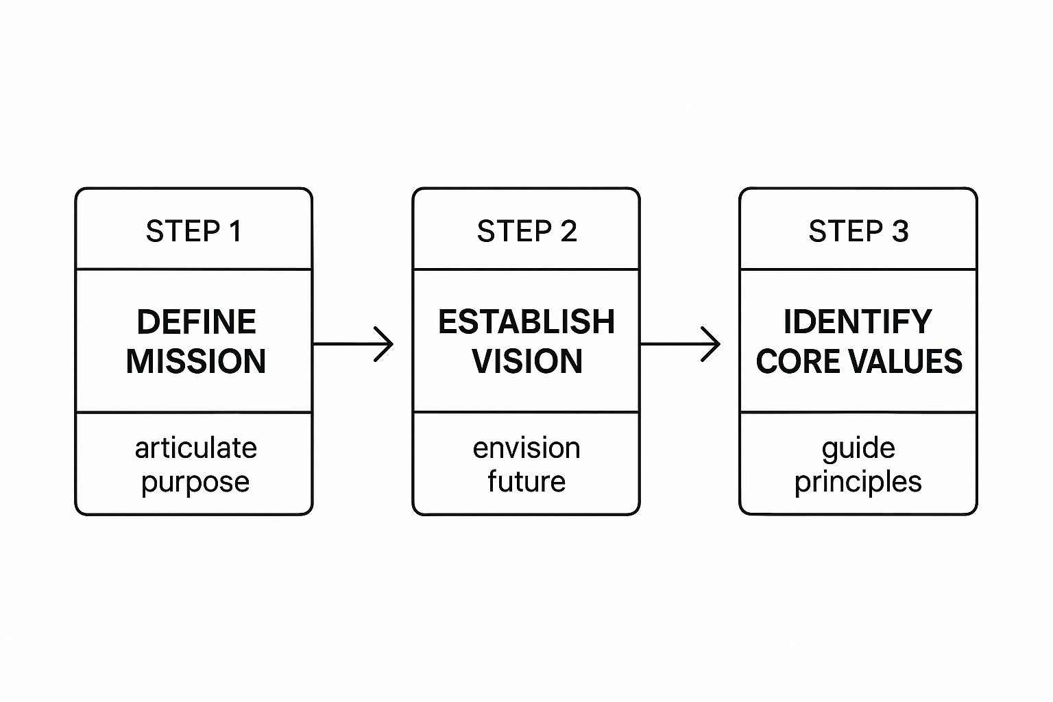
As you can see, you start with the why, look toward the where, and ground it all in the how.
Articulating Your Mission and Vision
First up is your mission statement. This is your "why." It needs to be a clear, no-fluff declaration of what you do and the problem you solve for people right now. For a sustainable coffee company, a solid mission might be: "To provide ethically sourced, specialty-grade coffee that supports small-scale farmers and promotes environmental stewardship." It’s direct, actionable, and focused on the present.
From there, you build your vision statement. This is all about where you're headed—the big, aspirational picture of the impact you want to make. That same coffee brand's vision could be something like: "A world where every cup of coffee contributes to a healthier planet and prosperous farming communities." This is what gets your team fired up and attracts customers who want to be part of that journey.
Your mission defines your current purpose, while your vision paints the picture of your ultimate destination. Both are essential for giving your brand direction and meaning.
Setting Your Core Values
Your core values are the bedrock of your company culture and behavior. They are the non-negotiables. These can't just be generic buzzwords like "innovation" or "integrity" that you see plastered on every corporate wall. They have to mean something, and you have to live them.
Give them real teeth. For instance:
- Transparency: We openly share our sourcing practices and pricing models.
- Community: We invest 10% of our profits back into the farming communities we partner with.
- Quality: We never compromise on bean quality, from farm to cup.
Suddenly, these aren't just words; they're promises. They become the filter you run every business decision through, making sure your actions always line up with what you say you believe.
Understanding Your Ideal Customer
Once you’ve figured out who you are, it’s time to get crystal clear on who you're for. Creating detailed customer personas is absolutely essential. Don't just stop at basic demographics. You need to dive deep into their psychographics—what are their goals, their biggest challenges, their motivations, and the things that keep them up at night?
For example, your target isn't "millennials, 25-35." It's "Eco-Conscious Alex, a 32-year-old graphic designer who values sustainability, is willing to pay more for ethical products, and gets frustrated by corporate greenwashing." See the difference? That level of detail is a goldmine. It ensures every part of your brand guide, from your tone of voice to your imagery, will hit home with the people who matter most.
Of course, getting this foundation right starts with knowing the crucial distinction between product vs brand.
Building Your Visual Identity System

Now that you've got the heart of your brand sorted, let's give it a face. Your visual identity is what people will see, touch, and remember. This isn't just about picking pretty colors and a cool font; it's a strategic process of turning your mission and values into a cohesive visual language.
The goal here is to create a system. A system where every single visual element—from your logo on a business card to the font on your website—instantly feels like it belongs to the same family.
Let's dig into the three core pillars that hold this system up.
Your Logo and Its Usage Rules
Think of your logo as the most concentrated expression of your brand. It's the visual handshake, your first impression. But a logo isn't just one static image; it’s a flexible tool that needs clear ground rules to stay effective.
To prevent your logo from being misused and weakening your brand, your guide needs to be specific. Start with your primary logo—the main, full-color version. Then, you'll need to create variations for different scenarios, like a simplified icon for a favicon or a monochrome version for black-and-white print jobs.
A huge mistake I see all the time is brands forgetting to define clear space. This is the non-negotiable empty space around your logo that keeps it from getting lost in a sea of other text or graphics.
Most importantly, show people what not to do. Don't just tell them; provide clear visual examples of logo misuse:
- Don't stretch or squash it. This is the fastest way to look unprofessional.
- Don't change the colors. Stick to the approved palette, no exceptions.
- Don't slap it on a busy or low-contrast background. If people can't see it clearly, it cheapens the entire brand.
Crafting Your Color Palette
Color is pure emotion. It’s one of the first things people subconsciously connect to a brand. In fact, research shows that a signature color can boost brand recognition by a staggering 80%. Your brand guide needs to lock down your color palette with absolute precision.
A solid, versatile palette usually breaks down like this:
- Primary Colors: These are the one or two dominant colors that scream "you." Think of the iconic red of Netflix or Spotify’s vibrant green.
- Secondary Colors: These are your supporting cast. They complement the primary colors and are perfect for accents, highlights, or differentiating between services.
- Neutral Colors: Your workhorses. These include shades of grey, white, or off-white for backgrounds and body text.
For every single color, you must provide the specific codes for both digital and print. This is non-negotiable for consistency. Make sure to include the HEX code for web, RGB for screens, and CMYK for anything that gets printed.
To help you get started, here is a quick checklist of the visual elements you absolutely must define.
Core Visual Identity Elements Checklist
| Element | What to Include | Example |
|---|---|---|
| Logo | Primary logo, secondary variations (e.g., icon-only, monochrome), clear space rules, and examples of incorrect usage. | The full Nike logo vs. the standalone "swoosh." |
| Color Palette | Primary, secondary, and neutral colors with specific HEX, RGB, and CMYK codes for each. | Tiffany & Co.'s specific shade of blue defined as PMS 1837. |
| Typography | Font families for headlines and body text, including specific weights (Bold, Regular) and size guidelines (H1, H2, p). | Mailchimp uses Cooper Light for headlines and Apercu for body text. |
Getting these three elements right is the foundation of a strong, recognizable brand identity.
Selecting Your Brand Typography
Typography is so much more than just choosing a font. It’s the visual voice of your written words. The fonts you select communicate a personality—are you a sleek, modern tech company or a warm, traditional craft business?
A smart typographic system usually relies on just two or three fonts. A popular and effective approach is to pick one for headlines and a separate one for body text.
- Headline Font: This one should be distinctive and attention-grabbing. It can have a bit more personality, but readability is still key.
- Body Font: This needs to be a workhorse. It must be crystal clear and easy to read at smaller sizes, especially for longer blocks of text.
Your brand guide should lay out the font family (e.g., Montserrat), specific weights (e.g., Bold, Regular, Light), and size hierarchies for things like H1s, H2s, and standard paragraphs. This takes all the guesswork out of the equation for your team and ensures everything looks clean and consistent.
While building your own guide is a fantastic start, it always helps to see how the pros do it. We’ve put together some great examples in our collection of creative guides to give you some inspiration.
Finding Your Authentic Brand Voice
How your brand sounds is just as critical as how it looks. Once you've nailed down the visuals, the next step is to give your brand a distinct personality. This is the magic that turns a faceless company into a character your customers can actually connect with.
This isn't about just picking a few generic adjectives like "friendly" or "professional." It’s about digging much deeper to find the little quirks and nuances that make you, well, you. Think of it like this: your voice is your brand's consistent personality, while your tone is the emotional inflection you use in different situations—like the difference between welcoming a new customer and handling a support ticket.
Defining Your Personality Spectrum
A really practical way to get specific about your communication style is to use a spectrum exercise. Instead of just landing on a single word, plot where your brand falls between two opposing traits. This simple trick forces you to be more precise and gives your team much clearer direction.
Try mapping your brand on a few of these spectrums:
- Witty vs. Serious: Are you quick with a clever joke, or do you maintain a more formal, authoritative stance?
- Technical vs. Simple: Do you lean into industry jargon to showcase expertise, or is your strength breaking down complex ideas into plain English?
- Enthusiastic vs. Reserved: Is your communication style full of energy and passion, or is it more calm and measured?
By charting your position on several of these, you'll start to build a multi-dimensional brand personality that feels authentic and real, not like a corporate robot.
Establishing Your Messaging Pillars and Story
With your personality defined, it’s time to build your core messaging. These are the handful of key themes and ideas that should show up in everything you say and write. They're the foundational pillars holding up your entire brand story.
And your brand story isn't just a boring history lesson. It's a compelling narrative that weaves your mission and values into something your audience genuinely cares about. This is where you craft your elevator pitch—a tight, 30-second summary of what you do, who you do it for, and why anyone should care.
Your elevator pitch and tagline are the most concentrated forms of your brand voice. They need to be memorable, easy to repeat, and instantly tell people what you're all about.
For instance, a tagline like "Design for Everyone" immediately signals accessibility and user-friendliness, guiding every piece of messaging that follows. To make sure that message consistently hits the mark, building an effective content strategy is absolutely essential.
A consistent voice builds trust, and trust is everything. Research shows a staggering 81% of consumers globally need to trust a brand before they'll buy from it. And with 77% of consumers saying they prefer to shop with brands they follow on social media, a brand guide that locks in a consistent voice is non-negotiable for building that connection. You can dig into more branding stats and insights on building consumer trust.
Ultimately, these guidelines empower your whole team to create content—from a quick email to a major ad campaign—that sounds unmistakably like you. That consistency is the secret to creating a memorable brand that people trust.
Putting Your Brand Guidelines to Work

A brand guide that sits in a forgotten folder is just a wasted effort. The real magic happens when your team, from marketing interns to freelance designers, actually uses it. This is where you bridge the gap between abstract ideas and tangible assets, setting up clear rules of the road to keep your brand from getting watered down.
Think about it: building a memorable brand is all about consistency. Every single touchpoint—from a massive billboard to a tiny social media icon—needs to feel like it came from the same place. This part of your guide is about taking the guesswork out of creative decisions.
Nailing Your Photography and Imagery
Photography is incredibly powerful. It’s often the fastest way to convey a feeling and tell a story about your brand. Your guidelines need to give people a crystal-clear picture of what an "on-brand" image looks like.
Vague instructions like “use authentic photos” are a recipe for confusion. Be specific. A tech startup, for example, might lay it out like this: “Our photos must feature real, diverse teams working together in bright, naturally lit spaces. No staged, cheesy stock photos. We want candid moments, not people staring at the camera.”
The most effective photography guidelines don't just show you what looks good; they explain why it’s the right choice. Always tie your photo style back to your brand's core values—whether that's a dedication to community, a passion for innovation, or a promise of transparency.
Make life easier for everyone by providing a go-to library of pre-approved images. If that's not possible, at least recommend a few stock photo sites that fit your vibe. This simple move saves hours of searching and prevents rogue visuals from making their way into your projects. For more ideas on visual strategies, you can always find great insights on the https://createinfluencers.com/blog.
Defining Your Illustration and Iconography Style
Illustrations and icons are fantastic for breaking down complicated information and injecting some personality. But without a clear direction, you can end up with a chaotic mess of different styles. Your guide needs to lock in a single, unified approach.
Start by defining the key characteristics of your style. Ask yourself:
- Line Style: Are we using thick, friendly lines or something thin and more refined?
- Color Use: Do our icons feature the full brand palette, or do we stick to just one or two core colors?
- Level of Detail: Should our illustrations be rich and detailed, or are we going for a more simple, abstract feel?
Show concrete examples of what to do—and just as importantly, what not to do. A fun, direct-to-consumer brand might use soft, rounded icons, whereas a financial firm would probably lean into sharp, precise geometric shapes. Getting this right ensures that every element, from a complex infographic to a simple app button, feels cohesive and intentionally designed.
Common Questions About Brand Guides
Even with the best guide in hand, you're bound to have questions as you start putting it into practice. Getting a handle on how to actually use and maintain this document is just as important as creating it. Let's dig into a few of the most common things people ask.
The big one I hear all the time is about updates. How often should you be revisiting your brand guide? Think of it as a living document, not a one-and-done project. I usually recommend a full, in-depth review at least once a year.
That said, don't wait for the annual review if something big changes. A major pivot in your business strategy, a new audience you're trying to reach, or a shift in your core mission are all great reasons to open it back up. Smaller tweaks, like adding a new logo file, can just be done as they come up.
Is a Brand Guide Really Necessary for a Small Business?
Yes, absolutely. It’s a huge misconception that brand guides are only for big-shot corporations with sprawling marketing departments. A startup or a small shop can gain a massive advantage from even a simple, one-page guide.
You don't need to build an 80-page behemoth right out of the gate. A basic guide covering the absolute essentials is more than enough to get started:
- Logo usage: Your main logo and some simple rules about clear space.
- Color palette: Just your primary brand colors with their HEX codes.
- Typography: The go-to font for your headlines and body copy.
- Brand voice: A few key adjectives that capture your brand's personality.
Putting this foundation in place from day one builds the consistency you need to become recognizable, which is everything when you're just starting out.
Here’s a pro-tip: Make your guide so easy to find and use that it's impossible to ignore. If people have to dig through five subfolders to find it, they won't. Pin it in your team’s Slack channel or put it on the front page of your shared drive.
A great way to get everyone on board is to lead by example. Create pre-branded templates for things like slide decks or social media posts. When doing it the right way is also the easiest way, people will naturally follow the guide. And for creators looking to turn that strong brand into revenue, exploring successful affiliate programs is a smart next step.
Ready to create a unique visual identity for your brand? With CreateInfluencers, you can generate custom AI characters and high-resolution images in minutes to bring your brand guide to life. https://createinfluencers.com